Comparing Two Values With A Dumbbell Plot In Python, Pandas and Matplotlib
By Alan Hylands

What is a Dumbbell Plot?
A Dumbbell Plot is a variation on the Lollipop chart and is often used as an alternative to the traditional clustered bar chart.
It’s made up of dot plots with two or more grouped series of data. The distance between the dots illustrates the difference between your two data points.
When would we use a Dumbbell Plot?
Simple answer is: when you get bored of looking at the same old clustered/grouped bar charts. I’m far from a visual artist when it comes to data visualization but even a dyed in the wool coder like me knows that you have to mix things up every now and again.
Real world examples of when to use the Dumbbell Plot are:
- Comparing expected sales for a particular quarter against actual sales.
- Checking event ticket bookings versus total capacity.
Let’s see an example.
I’m going to use Python to work up an example of a Dumbbell Plot. We’ll use the Pandas and Matplotlib libraries to help build up our dataframe and the Dumbbell Chart.
What’s our business problem?
Football fans tie themselves up in knots over their club’s league position at the end of a season. Judging whether a certain league position is “deserved” is very much a matter of subjective opinion. One measure we can use to work out an expected league position for each club is based on their annual wage bill.
Unlike American sports, there is no salary cap in football. Clubs can pay whatever they can afford to their playing staff. And we are going to use the English Premier League wage bill rankings to judge whether a certain club has been under or over-achieving for the past twenty years.
I am a Tottenham Hotpsur fan so we’ll use Tottenham as our example subject.
Where do we get the data?
The Telegraph and Guardian newspapers have ran annual articles rounding up the financial affairs of English Premier League teams. I used these as a secondary source while they often take their numbers straight from the clubs’ own reported accounts or the annual Deloitte Football Finance report.
What does the data look like?
We need a grouped series and two (or more) values to compare to each other for our Dumbbell Plot. Our series will be the season (named SEASON, in the format like 20002001 for the 2000/2001 season). And our two values will be a wage rankings position (WAGEPOS) and a league finish position (LGEPOS).
Let’s see some code.
- We’ll be using the pandas library to create our dataframe to work from. And the matplotlib library from pyplot to chart the Dumbbell Plot.
import pandas as pd
import matplotlib.pyplot as plt- I saved the data off in a .csv file and we can read that into a dataframe using pandas .
df = pd.read_csv("thfcwageslgepos.csv")
df
Which gives us this dataframe:
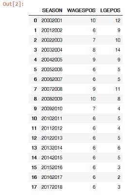
- We need to sort the values by SEASON to get them in the right order.
ordered_df = df.sort_values(by='SEASON')
my_range=range(1,len(df.index)+1)- The Python Graph Gallery has an excellent tutorial on this which I originally worked off to get the plot looking correct. I’ve changed some of the colours, columns and labels to suit our own data.
plt.hlines(y=my_range, xmin=ordered_df['WAGESPOS'], xmax=ordered_df['LGEPOS'], color='grey', alpha=0.4)
plt.scatter(ordered_df['WAGESPOS'], my_range, color='navy', alpha=1, label='WAGESPOS')
plt.scatter(ordered_df['LGEPOS'], my_range, color='gold', alpha=0.8 , label='LGEPOS')
plt.legend()

# Add title and axis names
plt.yticks(my_range, ordered_df['SEASON'])
plt.title("Comparison of the Wages Position and League Position", loc='left')
plt.xlabel('Value of the Positions')
plt.ylabel('Season')- And that’s it. This is what my Dumbbell Plot looks like:
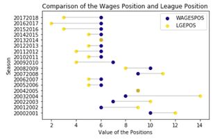
What does the chart tell us?
Let’s put our business analytics hats on for a second.
We started out wanting to know if Tottenham had been punching above their wage bill weight with regards to their league finishes. And it’s pretty clear that they have.
From our Dumbbell Plot we want to see the GOLD dots further to the left of the NAVY BLUE dots. And that has been happening pretty consistently from at least the 2008/2009 season onwards.
The navy blue dots for Wage Ranking have been incredibly steady in sixth position for the best part of the last decade. This means that any league finish over or above 6th should be looked at as a win for Tottenham fans.
Are there other ways to chart this type of data?
Yes indeed there are. As I said at the top, we could use the more traditional clustered bar chart approach. Or even a line chart to show the same data.
This is a quick clustered bar chart I did with the same data in Excel:
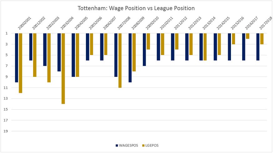
Having the desired position (at least in league position terms) being value=1 makes aligning this chart a little more difficult. As a reader, it doesn’t convey the message to me as quickly as the Dumbbell Plot and that’s what really matters.
I like the Dumbbell Plot better as it displays the differences more clearly between expected and actual values. It’s well worth trying out on your business data to see how it looks for your own use case.
And of course it brightens up a slide deck of the same old bar charts if you fancy a change.